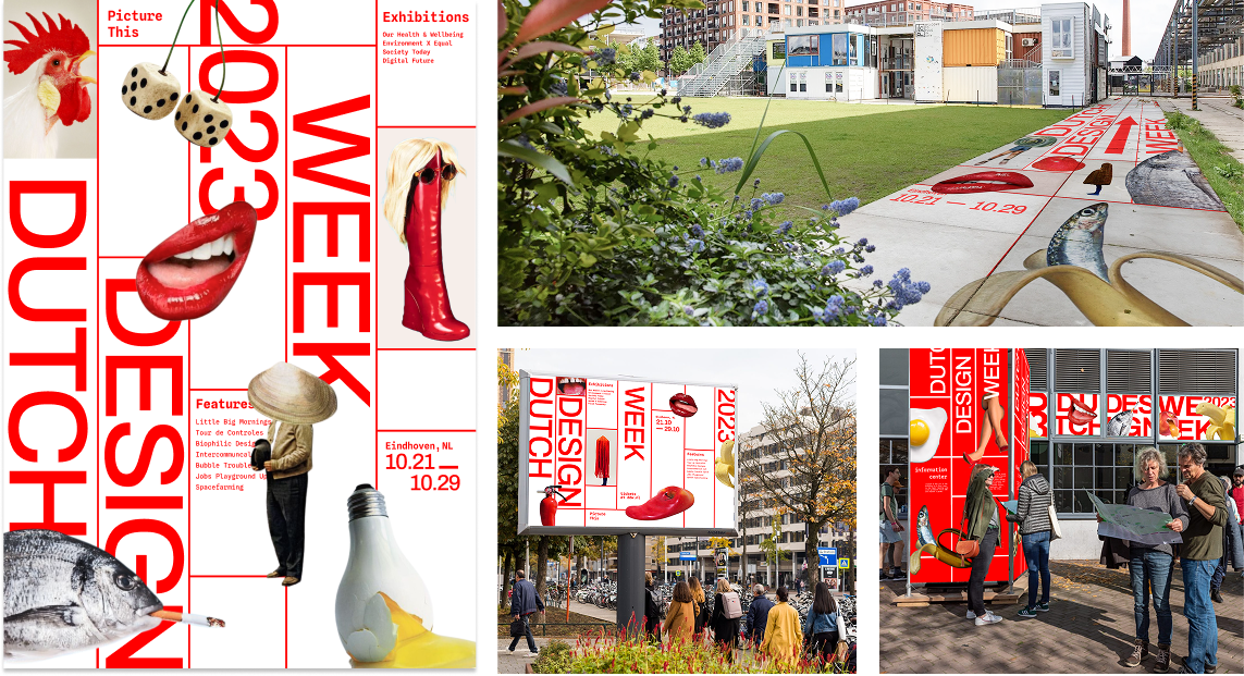
DUTCH DESIGN WEEK
Our project aimed to translate Dutch Design Week’s 2023 theme, “Picture This,” into a digital pre-exhibition experience that captures its speculative energy. I led interaction design and project direction, bridging visual experimentation with functional structure to create a microsite that feels exploratory, cohesive, and alive.
The Problem
Visitors often discovered exhibitions only after arriving at Dutch Design Week. There was little opportunity to explore themes or connect with the designers beforehand.
Studying designers & principles
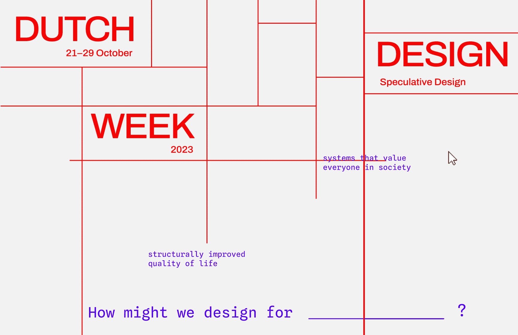
As a team, we studied designer Chris Ashworth and Ellen Lupton. This informed our final art direction that tested line, type, and asymmetry to communicate relationships.

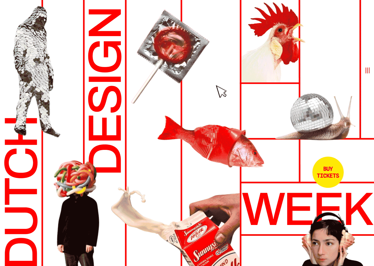
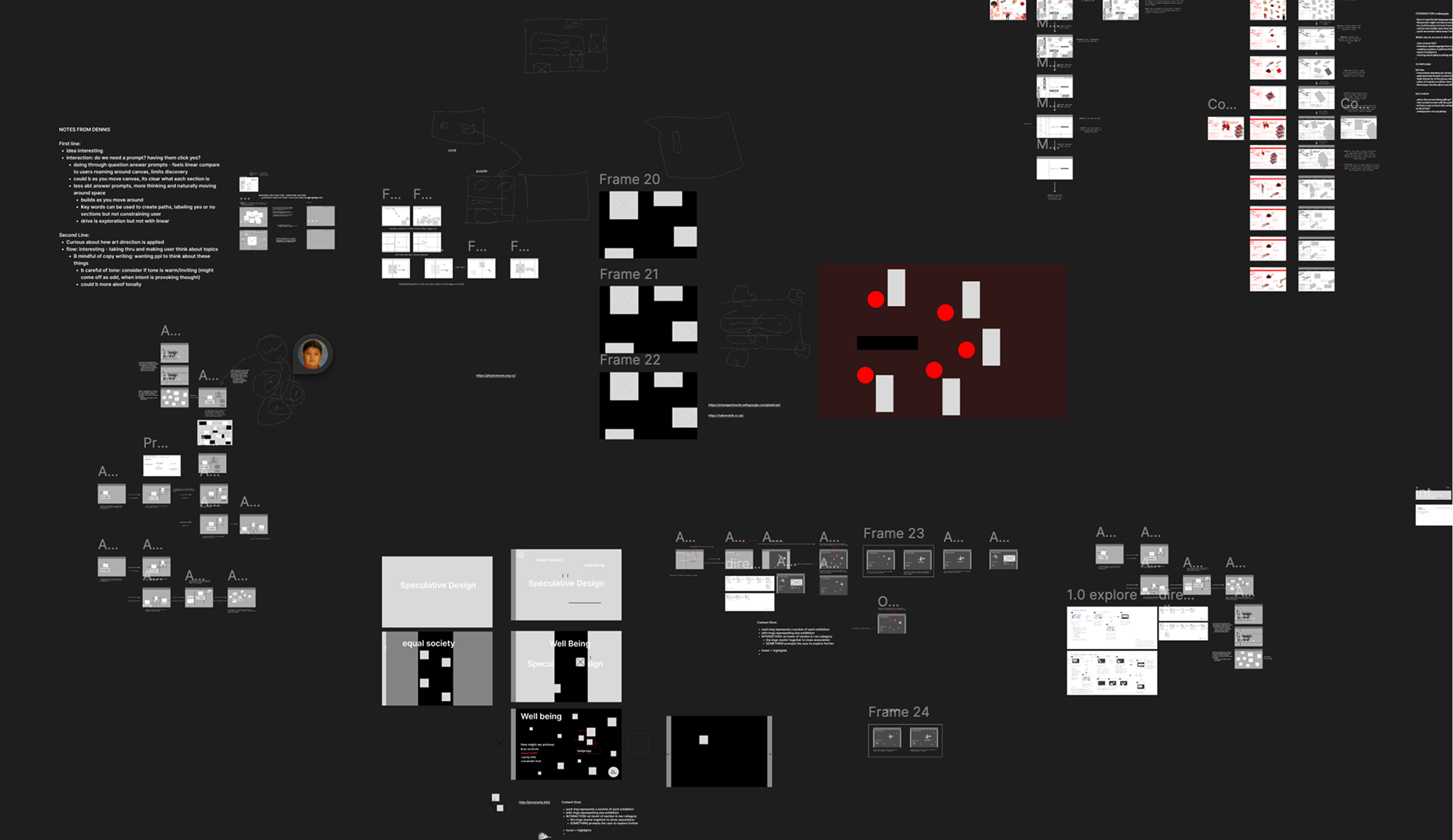
Graphic experimentation
We explored combinations of precedent principles and qualities to create posters that drove the final art direction.


Defining visual and content strategy
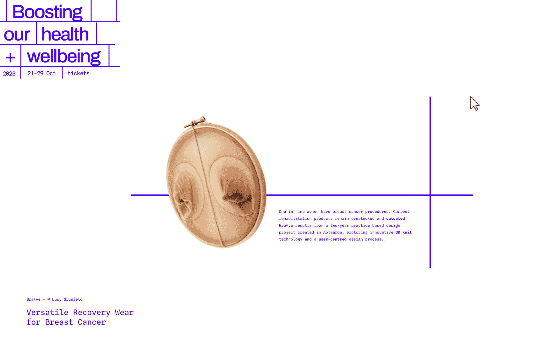
I defined a visual strategy that challenges convention to encourage engagement and exploration using provocative images and moving grid lines.
Strategy #1
Use provocative images to spur intrigue and drive deeper questioning.

Strategy #2
Use unconventional navigation to drive engagement and exploration.

Strategy #3
Use symmetrical moving grid lines to reinforce a dynamic experience.

My design rationale
Our goal was to create excitement and support better decisions on which exhibits to attend.
I aimed to capture speculative design energy while using grids to keep the microsite grounded.

Lateral interpretations
We explored how expression levels shape perception and interaction. We developed three directions along a spectrum from functional to fully expressive.
The Handoff
As the lead interaction designer, I ensured interaction flows and wireframes stayed clear and interpretable for our prototyper.
I designed 15 unique interactions across home, exhibition, and ticket pages.
My Workspace
After 7 weeks, my handoff included:
3 user flows and 15 interactions where
6 of them went into the final design.
A prototyped microsite designed
and mapped on Figma.
What I learned
Stepping up as a project manager.
One of the hardest weeks came when momentum collapsed. I did not uphold my responsibilities as a project manager. Personal life pulled my focus away, direction scattered, and motivation dropped. Leadership means holding space for the team and keeping alignment when things stall.
After that week I rebuilt structure and energy. We redefined goals and the team climbed to the top of the class for the rest of the project. Strong leadership means course correction when things go wrong.
Design needs a foundation.
Content first, visuals second.
Strong design depends on content strategy. Visual polish without meaning rooted in goals falls flat.
Every decision from typography to motion had to connect back to intent. This shifted my process toward clarity and purpose.